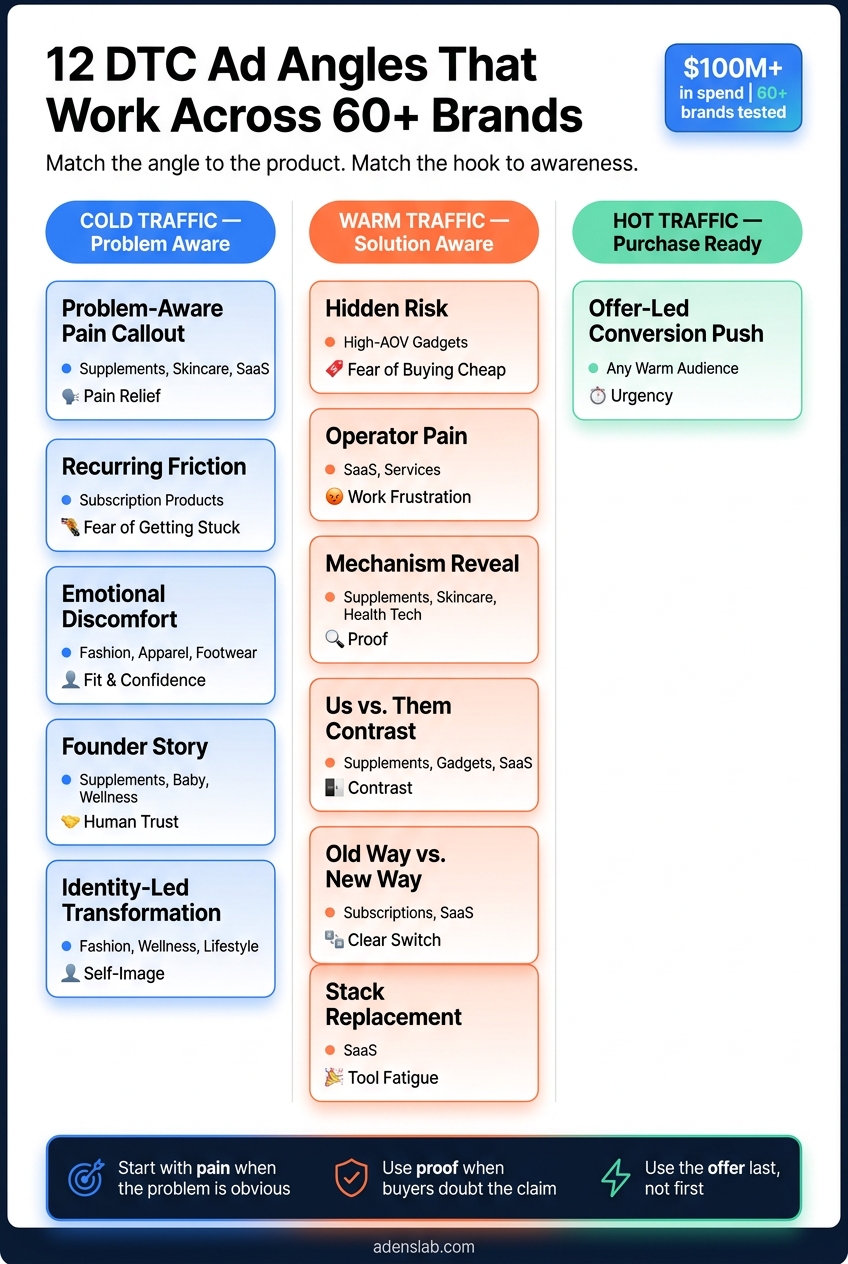
DTC Ad Angles That Printed Across 60+ Brands (Steal These Frameworks)

If your Meta ads stall, the problem is often the message, not the edit. After more than $100 million in spend across 60+ brands, the pattern is simple: the angle does most of the work.
Here’s the short version: I’d focus on 12 ad angles that match how people buy. Some work best for pain-driven products. Others fit fashion, SaaS, subscriptions, or high-ticket items. And I’d match each angle to buyer stage:
- Cold traffic: pain callout, founder story, identity
- Warm traffic: mechanism, comparison, old way vs. new way
- Hot traffic: offer push, final objection handling
The 12 angles covered in the article are:
- Problem-aware pain callout
- Recurring friction for subscriptions
- Hidden risk for high-AOV gadgets
- Emotional discomfort for fashion
- Operator pain for SaaS and services
- Mechanism reveal
- Founder story
- Us vs. Them contrast
- Identity-led transformation
- Offer-led conversion push
- Old way vs. new way breakdown
- Stack replacement for SaaS
What I like here is the core idea: an angle is the reason the product matters. It is not the hook, the offer, or the format. That one distinction clears up a lot of bad ad testing.
If I had to boil the full piece down even more, it would be this:
- Start with the buyer’s problem when pain is obvious
- Use proof when people doubt the claim
- Use comparison when buyers know the category
- Use identity when the product says something about the buyer
- Use the offer last, not first
12 DTC Ad Angles: Match by Product, Trigger & Funnel Stage
Quick comparison
| Angle | Best fit | Main trigger | Best stage |
|---|---|---|---|
| Problem-aware pain | Supplements, skincare, SaaS | Pain relief | Cold |
| Recurring friction | Subscription products | Fear of getting stuck | Cold/Warm |
| Hidden risk | High-ticket products | Fear of buying cheap | Cold/Warm |
| Emotional discomfort | Fashion, apparel, footwear | Fit and confidence | Cold/Warm |
| Operator pain | SaaS, services | Work frustration | Cold |
| Mechanism reveal | Supplements, skincare, health tech | Proof | Warm |
| Founder story | Trust-heavy categories | Human trust | Cold |
| Us vs. Them | Replacements, known categories | Contrast | Warm |
| Identity-led | Fashion, wellness, visible products | Self-image | Cold |
| Offer-led | Any warm audience | Urgency | Hot |
| Old way vs. new way | Products replacing a habit | Clear switch | Warm |
| Stack replacement | SaaS | Tool fatigue | Warm |
My take: this article is strongest when it keeps things simple. Match the angle to the product. Match the hook to awareness. Then test more openings before you rebuild the whole ad. That is the part most brands miss.
What an Ad Angle Actually Is
An ad angle is the main reason a product matters to a buyer. It’s not the visual, the discount, or the ad type. It’s the basic idea that makes someone pause and pay attention.
A lot of brands mix these up. That’s where things get messy.
| Element | What It Is | Example |
|---|---|---|
| Angle | The core reason it matters | "Why our ingredients are safer than the industry standard" |
| Hook | The first 3 seconds that stop the scroll | "Stop using toxic laundry detergent" |
| Offer | The specific deal or conversion trigger | "Get 20% off your first bundle" |
| Format | The ad format | 9:16 vertical video, static image, carousel |
Once you split the angle from the hook, offer, and format, the frameworks below become much easier to use.
I’ve used this same framework across jewelry, cat litter, baby gear, supplements, and SaaS.
The angle stays the same even when the format changes. The format is just the container. A founder-story angle can work as a UGC video, a static image with a quote, or a carousel that walks through the story.
Here’s the simple part: if the message gets repetitive, the account stalls.
That’s why this difference matters. And it’s why the first framework starts with the buyer’s pain, not the product. Next: the first angle that prints most often - the pain callout.
Why Angles Beat Pretty Creatives
When an ad stops working, most founders make the same move. They swap the editor, bring in new actors, or test a different format. But in most cases, production wasn’t the issue. The message was.
The angle is the ad. Everything else is packaging.
I’ve seen the same core angle work in a rough iPhone video and in a polished studio shoot. That’s the point: a slick edit can help, but it can’t save a weak argument. The first angle that tends to work is usually tied to the buyer’s pain.
What wears out accounts isn’t just format fatigue. It’s repetition. A winning ad rarely fades because the style got old. It fades because the audience has already heard the pitch.
Once you see the message as the main lever, you can build a system to come up with new angles instead of guessing. That’s what ADEN'S LAB does: turn product and customer signals into new angles fast. Next, I’ll show the pain-callout angle that prints first for most brands.
1. Problem-Aware Pain Callout
Cold buyers know the problem before they know the brand. That’s the opening. So start with the buyer’s problem, not the product.
Lead with the pain and sit in it for a moment. Then bring in the product as the way out. Put the buyer’s friction front and center before you show what you sell. A simple way to do that is the problem-agitation-solution setup: about 60% problem and agitation, 40% solution.
Use the “Ever tried / ever noticed?” hook pattern. It pulls out a quiet frustration the viewer already feels but may not say out loud. MaryRuth Organics used this same question-led framing to make the pain feel immediate and familiar. That kind of specificity helps stop the scroll. Use vertical UGC video and keep it raw, plainspoken, and direct.
This angle tends to work best when the product removes discomfort in a clear way, like with:
- supplements
- skincare
- fitness
- subscriptions
It can also work for SaaS and services when the pain is operator pain, like high CAC or weak creative testing. But it loses steam with aspirational fashion and premium goods, where identity and lifestyle often drive the click more than pain relief. This angle hits hardest when the buyer feels the problem every single day.
When the pain keeps coming back instead of showing up once, the next angle is friction.
2. Recurring Friction for Subscriptions
If the first angle sells relief, this one sells commitment.
A subscription doesn't just sell the product. It also sells the choice to keep paying. That's a different buy, and for many people, it's a tougher one. Use this angle for cold traffic that feels the problem but pauses at recurring billing. The goal is simple: lower the fear of getting stuck in a subscription.
The trigger here is trust and relief, not urgency.
Lead with a hook that calls out the recurring hassle: running out, having to reorder, or paying for something you might forget to use. That kind of detail gets attention because it feels specific and familiar.
For cold audiences, the best format is vertical UGC video. Keep it under 45 seconds. Stay focused on commitment friction, not only on product perks. For warmer audiences, static social proof and Reasons Why listicles work well to close the trust gap. For warmer audiences, authority-led creative also helps close that gap.
One format worth testing is the "reply to comment" UGC-native style. Huel uses it to answer objections like "is it actually worth the money?" It feels organic, lowers skepticism, and makes hesitation around recurring billing easier to handle.
Pull exact wording from reviews and support tickets. Then pair the friction-removal message with a subscribe-and-save offer to lower the commitment barrier.
When the objection isn't recurring billing, but a higher upfront risk, the angle changes.
3. Hidden Risk for High-AOV Gadgets
When the issue isn't recurring billing, but the risk of a big upfront buy, the pitch has to change.
I use this angle for skeptical buyers who already tried the cheap option and got burned. At that point, my job isn't to explain the product. It's to show the hidden cost of staying cheap. This works best when the buyer already knows the product category but isn't sold on paying more.
The trigger here is trust. Premium buyers want proof that paying more helps them avoid a real cost. Ridge Wallet is a good fit for this approach because it turned the bulky default into the problem and used a simple Us vs. Them contrast to show why the premium was worth it.
Static Us vs. Them works well in this case. Side-by-side callouts make it easy to compare the premium option with the category default. If the premium needs more explanation, use polished short-form video instead of lo-fi UGC. Polish matters here only when the mechanism needs proof.
Lead with the cost of sticking with the default, not with the product itself. “Why your [current solution] isn’t working” lands harder than opening with the product name. Show the risk first. Then show the fix.
If the risk is emotional instead of functional, move to the next angle.
4. Emotional Discomfort for Fashion
When the objection is about self-image, not price, fashion needs a different approach.
This angle works best when the ad clears up two questions fast: Will this fit me? And What do I wear it with? Start here with cold traffic. If you need help scaling, consider Meta ads management services. Then reuse it for mid-funnel buyers who are stuck on sizing or fit.
It works well for apparel, footwear, and accessories where fit and confidence drive the sale. Think shapewear, denim, or shoes made for wide feet. True Classic used UGC to ease fit anxiety and scaled into a major apparel brand.
In fashion, the pain point often isn’t cost. It’s confidence. That’s why 9:16 UGC is a smart place to start. After that, test GRWM clips, fit demos, and grid statics. Show how the fabric falls on real bodies. If shoppers are between sizes, show that exact case. Don’t dance around it.
Keep most of the ad focused on the fit problem. Let the relief land at the end.
When the problem is operational instead of emotional, the next angle changes completely.
5. Operator Pain for SaaS and Services
This is the operator version of the pain callout. Fashion sells self-image. SaaS and services sell relief from messy workflows.
I use this angle for cold, problem-aware operators. They already know something's off. They just haven't fixed it yet. The trigger is frustration: slow workflows, manual handoffs, rising CAC, or teams still running Meta in spreadsheets.
The hook needs to qualify the buyer fast. For example, If you're a DTC founder scaling Meta and creative is the bottleneck... tells the right person this is for them before the offer even shows up. Start with the friction, then move to the fix.
For services, I usually start with founder-led vertical video. It builds trust fast because it feels like one operator talking to another. For SaaS, I pair this angle with a short product demo, usually 20 to 40 seconds, that shows the interface fixing the workflow problem in plain view. Skip the polished production. Show the workflow, not a feature tour.
Use static for proof. Annotated feature callouts work well. For cold traffic, lead with video.
When the buyer already feels the pain and needs proof that the fix works, the next angle is mechanism reveal.
6. Mechanism Reveal
After pain comes proof. This angle is your proof layer.
Most buyers have already heard the promise. What they want now is the reason the product works. Once the pain is clear, the next thing they ask is simple: How does this actually work?
Use this in the middle of the funnel, when the buyer already knows the problem and is lining up options side by side. The trigger here is trust. Don’t sell the vibe. Prove the mechanism.
This angle works best for supplements, skincare, health tech, and any product where the sale depends on an ingredient, a process, or a spec. A generic benefit hook won’t cut it.
For static ads, keep the layout clean and direct:
- One product image
- Three to five callouts
- Arrows pointing to the key ingredient or component
- Price at the bottom
The goal is to make it read like a spec sheet, not a glossy ad.
"Annotation feels informational, not promotional. The viewer processes it like content. The arrows and callout boxes create a natural reading path." - Curtis Howland
For video, keep it short: 20 to 40 seconds. Put the founder or a credentialed expert on camera and have them explain the mechanism behind the result in plain language. Direct-to-camera, iPhone-style footage often beats polished studio production here because it feels more credible. That camera choice isn’t just about style. It helps the buyer believe the mechanism is real, not just packaged for sale.
If the mechanism isn’t the main reason someone buys, the next lever is the founder story.
7. Founder Story
When the proof is there but trust is still shaky, a founder story can do the heavy lifting. This is a trust angle, not a polished brand video. Cold buyers usually need a bit of context before they buy. A product-first ad often asks for trust too soon.
Use a real founder who faced the same problem the product now solves. Keep the format simple: 9:16 talking-head video, shot lo-fi on an iPhone. Start with the founder’s struggle in the first 3 seconds, then show the product as the answer.
This works best when trust matters more than feature-by-feature comparison. Think:
- Supplements
- Skincare
- Baby products
- Wellness
These are trust-heavy categories. A founder’s story can cut through doubt in a way a product page usually can’t.
The thumbnail should show the founder’s face, and the video should open on their face in the first 3 seconds. That matters most when the buyer has never heard of the brand. Keep the talking points in bullets, not a full script. If the founder sounds rehearsed, trust drops fast.
If the founder story builds trust, the next angle uses contrast to make the choice feel sharper.
8. Us vs. Them Contrast
When the buyer already knows the category, stop walking through features. Start showing the difference.
Put your product next to the old way, the default option, or the clunky alternative. That comparison lands best when the buyer already knows the pain, trusts the brand, and has seen proof.
At this stage, they don't need to sort through every option from zero. They just need to see that your product beats what they're using now.
Use this angle when the buyer already has a go-to solution in mind. Keep the message informational, not hostile. It tends to hit hardest at MOF, but it can also work at TOF when you're trying to knock an incumbent out of the buyer's head.
For format, start with a split-screen static. After that, test split-screen video or comparison charts with arrows and callouts.
This angle tends to work best for subscriptions and high-AOV products that replace a clear default. Think supplements, skincare, and premium replacements where buyers already know the standard option and feel some quiet frustration with it. Start with a generic category comparison, then shift to the implied competitor.
When contrast alone doesn't get the sale over the line, the next lever is identity.
9. Identity-Led Transformation
When contrast grabs attention but doesn't spark want, identity fills that space.
This angle sells who the buyer believes they are or wants to be, not just what the product does. The purchase is about status, belonging, or self-image, and the product becomes the proof. Put simply, this works best when the product feels like a badge, not just a fix.
Use this angle when the purchase signals status, belonging, freedom, or strength. It fits premium goods and visible categories like apparel, wellness supplements, performance gear, and skincare. In these categories, what someone buys often says something about who they are.
For format, start with aspirational lifestyle video. A polished static hero image or a grid collage can work too, as long as it sells the world around the product, not just the SKU. Founder-led video makes sense only if the founder is part of the identity the brand sells. And yes, lo-fi iPhone-style video can work just as well when it feels lived-in instead of staged.
Open with the person, not the pain. Lead with persona-driven lines like: "For people who…" or "If you're the kind of person who…" That's the hook pattern. It reflects aspiration, not friction.
If identity on its own doesn't push the buyer forward, the next angle makes the offer itself the reason to buy.
10. Offer-Led Conversion Push
This is the last angle I use once the buyer already knows the product. It’s bottom-of-funnel only, not a prospecting angle.
The idea is simple: use fear of missing the deal. In many cases, a deadline does more work than a long list of benefits. The best format is usually a static ad with bold brand color, a clear offer, and urgency right up front.
Where this angle works best depends on the product:
- Subscriptions: a first-order discount lowers the friction to get started.
- High-AOV: bundle discounts can soften sticker shock.
- Fashion: limited-time drops tend to work well during seasonal sales.
This angle usually falls flat on cold traffic. If someone doesn’t know the brand, a discount alone doesn’t explain what they’re buying or why it matters. That’s why this works best with warm audiences who already know the brand. Start with problem, mechanism, and identity first.
If the offer still needs more context, the next angle is old way vs. new way.
11. Old Way vs. New Way Breakdown
Use this angle when your offer needs one more layer of context. It fits best when the buyer already has a default method, habit, or workaround and just needs a clearer reason to switch. Instead of asking them to judge your product on its own, you frame it against the thing they already want to move away from.
"They do not need to evaluate yours in isolation. They only need to agree that yours is better than what they are currently using." - Curtis Howland
This works best in MOF and with warm TOF traffic. For cold audiences, a plain Problem-Solution hook usually lands better.
Start with a static split screen or a simple chart. If the method only makes sense with movement, go with a 9:16 video.
Here’s how I’d frame it by product type:
| Product Type | "Old Way" Trigger | "New Way" Payoff | Best Format |
|---|---|---|---|
| Subscriptions | Messy routines, too many pills, unclear ingredients | Simple routines, complete nutrition, transparent sourcing | Listicle or feature callout static |
| High-AOV Gadgets | Bulky, cluttered, outdated design | Slim, premium, modern | Side-by-side static |
| SaaS / Services | Manual work, complex UI, high friction | Automation, clean interface, done-for-you | Product demo video |
| Fashion / Beauty | Heavy, artificial, or uncomfortable | Lighter, cleaner look | UGC-native or mood board |
The goal is simple: the buyer should feel the switch, not stop and study the ad.
Keep the comparison educational, not combative. Stay tied to real friction people deal with. Don’t build a strawman. Don’t invent pain points that aren’t there. Once the contrast feels overdone, trust drops fast.
If the buyer is replacing an entire stack, not just a method, the next angle is stack replacement.
12. Stack Replacement for SaaS
For SaaS, this angle is the stack-replacement take on the old-way/new-way idea. It fits consideration-stage buyers. They already know the category. What they want is a cleaner move from a messy stack of tools to one workflow. The question isn't whether your product is better. It's whether it can replace the patchwork they use now.
Start by tying your product to the friction in the current stack. Once the buyer feels that tool fatigue, show the replacement clearly.
A static comparison chart or an annotated side-by-side works well here. For SaaS, put the interface first. That helps answer the proof objection fast. Specific language matters. "Replace 3 tools" lands better than "all-in-one." If you use video, keep it in the 15–30 second range and lead with the interface.
| Element | Stack Replacement Details |
|---|---|
| Best Funnel Stage | Mid-Funnel (MOF) / Consideration |
| Best-Fit Product | SaaS, workflow-heavy services |
| Core Trigger | Tool fatigue; anchoring against a fragmented incumbent stack |
| Strongest Format | Static comparison image or educational carousel |
Keep it educational. If it sounds like a takedown, trust drops.
How to Match the Right Angle to the Right Product Type
Match the angle to the product’s buying problem. That’s the part that changes everything.
At this stage, the angle matters more than the ad format. Why? Because the product type usually tells you which trigger will hit first. In practice, that trigger is often one of these: proof, risk reversal, identity, or workflow relief.
For subscriptions, lead with social proof, before and after, mechanism reveal, and data callouts. Those angles help people see that the product works and why it works. Founder story and us vs. them can help, but they should play a support role. A plain product hero ad usually isn’t enough here.
For high-AOV gadgets, lean on feature callout, product demo, founder story, and hidden risk. When people are spending more, they want to see what the product does and what could go wrong if they choose the default option instead. Us vs. them can work well when the contrast is clear. What should you avoid? Lo-fi creative that makes the product look cheap.
For fashion and jewelry, the product should be the star. Use UGC-native, grid/mood board, emotional discomfort, identity-led transformation, and aspirational lifestyle angles. These products often sell through taste, self-image, and desire. Heavy science language and operator-pain messaging usually feel out of place.
For SaaS and services, start with the pain in the day-to-day work. Operator pain, stack replacement, and old way vs. new way are the core angles. Then use product demo and testimonials to back up the pitch. Aspirational lifestyle ads tend to miss the mark here.
| Product Type | Primary Angles | Skip These |
|---|---|---|
| Subscriptions | Social Proof, Before & After, Mechanism Reveal, Data Callouts | Product hero only |
| High-AOV Gadgets | Feature Callout, Product Demo, Founder Story, Hidden Risk | Lo-fi/ugly creative |
| Fashion & Jewelry | Product Hero, UGC-Native, Grid/Mood Board, Emotional Discomfort, Identity-Led Transformation, Aspirational Lifestyle | Science-heavy ads, operator pain |
| SaaS & Services | Operator Pain, Stack Replacement, Old Way vs. New Way, Product Demo, Testimonials | Aspirational Lifestyle |
Product type gives you the base angle. Buyer awareness tells you how to frame the hook. Once you’ve matched the angle to the product, the next step is the awareness stage.
How to Use These Angles by Buyer Awareness Stage
Angle and awareness stage need to line up. If they don't, you'll burn budget fast. Even a polished ad can flop when it shows up at the wrong moment. The angle itself can stay the same. What changes is the hook.
Cold traffic doesn't know you yet. Start with Problem-Aware Pain Callout, Founder Story, or Identity-Led Transformation. These angles help people feel seen before they care about your brand or product. Once they spot the problem, you need to show proof.
Warm traffic has already come across you. Now you're building trust and handling objections. Use Mechanism Reveal, Us vs. Them, and Old Way vs. New Way. These angles show why your product works and why it's better than the usual fallback. Once the buyer believes that, the offer becomes the last hurdle.
Hot traffic already knows the product. At this stage, they need a clear nudge and fewer reasons to hesitate. That's where Offer-Led Conversion Push fits, along with retargeting ads that answer final objections like price, shipping time, or return policy. Keep it direct.
| Awareness Stage | Angles That Work |
|---|---|
| Cold | Problem-Aware, Founder Story, Identity-Led |
| Warm | Mechanism Reveal, Us vs. Them, Old Way vs. New Way |
| Hot | Offer-Led, Objection Handling |
The stage sets the trigger. The hook does the heavy lifting. Next, I'll break down the hooks that fit each angle.
The Best Hooks to Build Under Each Angle
The hook is the opening line that carries the angle. The angle is why the ad matters. The hook is the first 3 seconds that make someone stop scrolling long enough to hear the message. The angle stays the same. The hook changes based on buyer stage.
One winning angle should give you 5–8 hooks. Keep the body and CTA fixed. Change the opener. That’s the starting point for each angle:
| Angle | Best Fit / Use Case | Hook |
|---|---|---|
| Problem-Aware Pain Callout | Wellness, Beauty, SaaS | "Ever notice your [pain point] is getting worse?" |
| Recurring Friction | Subscription Ecommerce | "If you hate reordering every month, keep watching." |
| Hidden Risk | High-AOV Products | "Stop doing [common mistake]." |
| Founder Story | High-AOV Products | "I built this because every other option failed me." |
| Us vs. Them | Supplements, Gadgets | "Why we beat the default." |
| Mechanism Reveal | Supplements, Skincare, Health Tech | "Here's why this works." |
| Identity-Led | Fashion, Lifestyle | "For people who want their clothes to say something." |
| Offer-Led | Warm and Hot Retargeting | "This deal disappears [date]." |
| Operator Pain | SaaS, Services | "How I [result] in [timeframe] - without [common frustration]." |
| Old Way vs. New Way | Subscriptions, SaaS | "Stop doing [common mistake]. There's a faster way." |
Cold hooks should create recognition. Warm hooks should answer doubt. Hot hooks should push the deal.
Question-based and pattern-interrupt hooks often beat product-first openers because they create relevance and curiosity fast. That’s the whole game in the first few seconds. If the opening lands, the rest of the ad gets a shot.
Don’t stop at one hook. Keep the body and CTA fixed. Change only the opening. That’s the fastest way to stretch one winning concept without rebuilding the ad from scratch.
"A strong hook with average body content outperforms a weak hook with excellent body content." - Kamal Razzak, Founder, MHI Media
The metric I use is Hook Rate: 3-second views divided by impressions. Use Hook Rate to rank openings. Then keep the hooks that hold attention.
Next, I'll map these hooks to buyer stage and product type.
Two Tables That Make These Angles More Actionable
If the angle is the idea, these tables turn that idea into the actual ad.
They handle two simple jobs:
- Story split
- Offer match
Table 1: Old Way vs. New Way
This is the story split.
| Dimension | The Old Way | The New Way |
|---|---|---|
| Hook focus | Opens with the product or brand logo | Opens with the problem, agitation, or pattern interrupt |
| Messaging | Sells features and specs | Sells transformation or emotional relief |
| Production style | Polished studio shoot | Smartphone-quality, lo-fi content |
| Trust signal | Generic brand voice or paid actors | Founder-led story or real customer testimonials |
| Ad structure | 60% product, 40% problem | 60% problem, 40% solution |
| Specificity | Vague claims like "lose weight" | Specific claims like "lost 23 lbs" |
The shift here is pretty clear. The old way talks at people. The new way meets them where they already are.
And one row matters more than most: specificity.
Specific claims stop scroll. Vague claims don't.
Table 2: Offer Type Fit by Angle
The offer should match the friction. If it doesn't, even a good angle can fall flat.
| Ad Angle | Best Product Type | Ideal Offer Type | Why It Fits |
|---|---|---|---|
| Problem-Aware Pain | Supplements, skincare, SaaS | Money-back guarantee or free trial | Removes the risk of trying something for a known problem |
| Recurring Friction | Coffee, vitamins, other replenishable goods | Subscribe & Save | Directly fixes the reorder pain |
| Hidden Risk | High-AOV gadgets | Free shipping or easy returns | Lowers commitment on a bigger purchase |
| Mechanism Reveal | Health tech, complex SaaS | Free gift with $X spend | Rewards curiosity after the buyer learns how it works |
| Us vs. Them | Apparel, home goods, SaaS | Bundle + savings math | Makes the value gap obvious |
| Identity-Led | Fashion, beauty, new-to-market brands | Exclusive access or limited drop | Feeds the insider status the angle promises |
| Offer-Led Conversion | Seasonal goods, fashion | Flash sale or limited quantity | Best when the urgency lives in the offer |
Next: how I scale once an angle starts winning.
How I Scale Once an Angle Hits
Once a hook starts driving purchases, I stop fiddling with it and start backing it with spend. A lot of people find something that works, bump the budget by 10%, wait a few days, then bump it again. That isn't scaling. It's hesitation.
When an angle is the real deal, I increase budget aggressively, often 50% to 200% in one move. A strong angle gives Meta a cleaner purchase signal, which helps it optimize for buyers. At that point, Meta doesn't need more tinkering. It needs spend behind the ad.
I still wait for enough purchase data to make sure performance is steady. If the hook can't keep attention, I cut it. If the ad keeps proving itself, I move it into Advantage+ Shopping and optimize ONLY for purchase. Then I keep a close eye on decay and swap the ad out before it loses steam.
That's exactly how BFCM 2025 drove $544,397 in 72 hours. The angles were already validated before the sale window opened. So when it was time to scale, the creative held up because the hooks were proven. We didn't scramble to find winners in the middle of the sale. We already knew what was working and gave it more fuel.
Scaling only works if you refresh the winner before it cools off. Creative fatigue shows up fast. I watch for CTR to soften and frequency to climb, then refresh before results slide. In practice, scaling and creative production need to run side by side.
If You Want This Built for You
Once an angle starts printing, the next bottleneck is new variants.
That’s why I built ADEN'S LAB. It takes your product URL, offer, and positioning, then turns them into ready-to-test Meta ads. That volume matters, because fatigue can hit fast once an angle starts working.
On the media buying side, I run a cost-cap playbook, use Advantage+ Shopping once the angle has proven itself, and build custom funnels and tracking when the account calls for it.
If you want to see how I work, take a look at my services page. And if you want a direct read on what’s holding your account back right now, book a 30-minute strategy call - direct with me, you leave with a diagnosis either way.
Conclusion
Founders often blame the product, the price, or the offer. But most of the time, the real issue is the angle.
I’ve seen the same 12 frameworks keep working across very different brands. They cover the whole range: pain, proof, contrast, identity, and offer. And they work for a simple reason: they line up with how people buy - through pain, identity, skepticism, and awareness.
Match the angle to the product. Match the hook to buyer awareness. Then push hard once a winner can hold spend.
At scale, the bottleneck isn’t strategy. It’s creative volume. That’s exactly what ADEN'S LAB and my services work are built to solve.
If you still want the edge cases, the FAQ below covers them.
FAQ
When the framework starts to feel a little abstract, this is the practical version.
What is an ad angle, and how is it different from a hook or creative format?
An angle is why the ad matters. A hook is the opening line or moment that gets attention. A format is the container, like UGC, founder-led, static, or demo.
Which ad angles work best for ecommerce brands on Meta?
The angles that tend to work most often for ecommerce brands are Problem-Solution, Us vs. Them, Product Demo, Testimonials, and Founder Story. The key is simple: match the angle to how aware the buyer already is.
Does the founder story angle actually work on Meta?
Yes. It can build trust fast. It feels human instead of overly scripted, which matters a lot on Meta. I use it most often for newer brands that need trust fast.
What angles work best for high-AOV products?
For high-AOV or more complex products, I usually lean on Product Demos, Founder Stories, and Mechanism Reveal. Those angles help answer skepticism before it kills the sale.
How do I scale a winning Facebook ad creative once it starts converting?
I scale only after a concept shows it can hold spend. Once it does, I push harder and test new hooks built on the same winning body. That’s how I stretch a winner without changing the core message.
How do I choose the right DTC ad creative strategy for my product?
Use this rule, not the brief’s aesthetics: map the angle to buyer awareness.
- Problem-Solution for problem-aware buyers
- Us vs. Them or Mechanism Reveal for people comparing options
- Testimonials or Offer-led for traffic that’s ready to buy
Match the angle to buyer awareness, not taste.